THE ORIGINAL CLUB BADGE: 1961-2018
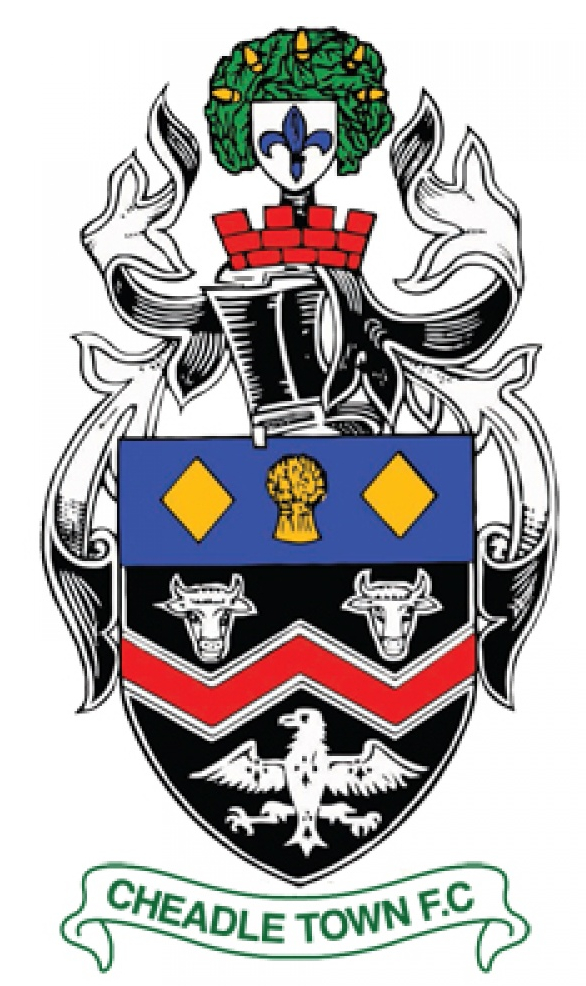
For those of you interested in heraldry you may be wondering what all of the different elements of the original Cheadle Town FC badge represented.
The original club crest was taken directly from the coat of arms granted to the Cheadle & Gatley Urban District Council back in December 1955...before it became part of Stockport Metropolitan Borough Council.
Starting from the top of the crest downwards you'll notice an oak tree with five golden acorns: these represent the five areas of Cheadle, Cheadle Hulme, Gatley, Heald Green and Adswood.
Moving further down we see two golden lozenges - taken from the coat of arms of the Stopford or Stokeport family (which gave the town its name) - sat astride a wheatsheaf which represents the Earls of Chester and to Cheshire (you'll notice a lot of Cheshire-based sports clubs will have the wheatsheaf on their badge).
The blue background that they sit upon represents the Stockport Etchells whilst the red 'W' lower down is from the arms of the de Chedle family...which gave the local area its name.
The two bulls heads and the eagle? They represent two further historical families - the Bukeleys and the Moseleys respectively.
And finally there's the fleur-de-lys in the background which represents the parish of St.Mary's.
A NEW ERA: 2018 onwards
When the club became part of the Little Sports Group in the turn of the year in 2018 it was re-branded.
As well as a change in club colours we also saw a change in the club badge from the more heraldic one that had existed since the club's inception in 1961 to a more modern-looking, sleek version.
The new badge doesn't see a complete change, though.
In a nod to the original badge certain elements were carried over, namely the two golden lozenges and one of the bull's heads.